
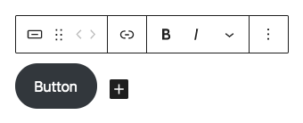
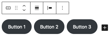
Buttons Block
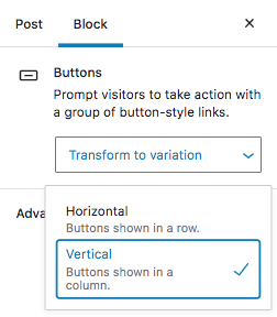
- Change the style of the button (Fill or Outline);
- Change the button colour and text colour;
- Select a default style for any additional button blocks you add to the post/page;
- Change the radius of the button corners (to make the corners square, set the radius to 0);
- Set the button link to open in a new browser tab;
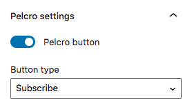
- Set the button to trigger a Pelcro modal (Subscribe, Login, or Register).
Linking inside pages and posts
You can use buttons to jump from one part of the page/post to another. For that, you'll need to:
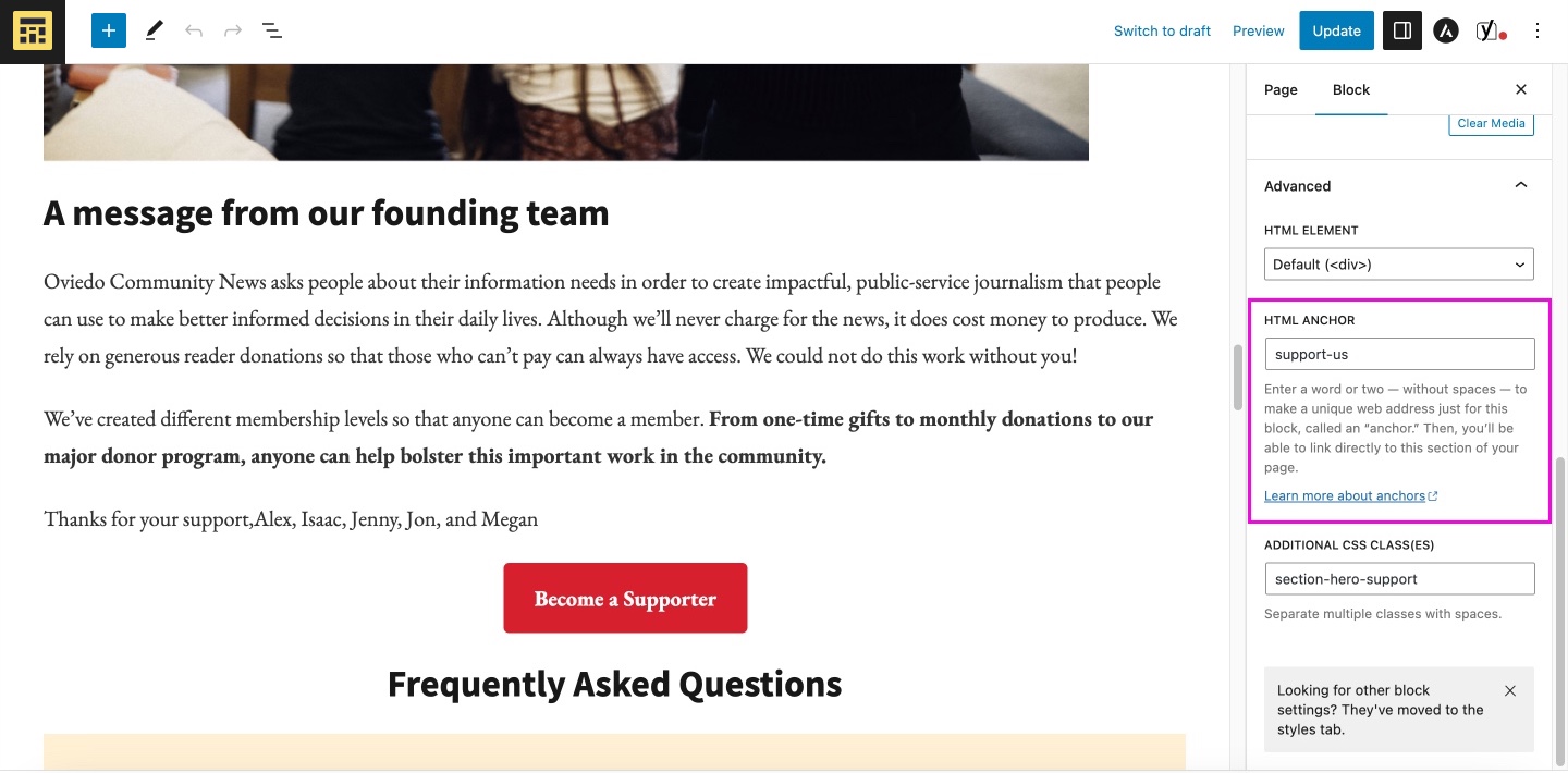
- Add an anchor: select a block (Separator block, Paragraph block) and, on the right sidebar, scroll down to the Advanced section > HTML anchor.
- Add a text on the HTML anchor, like "lessons-3"
- Now select the button and add a link. Anchors link starts with #, so you will add #lesson-3 as a link.
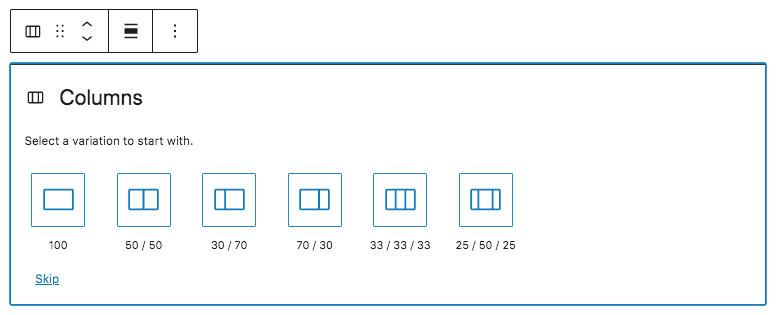
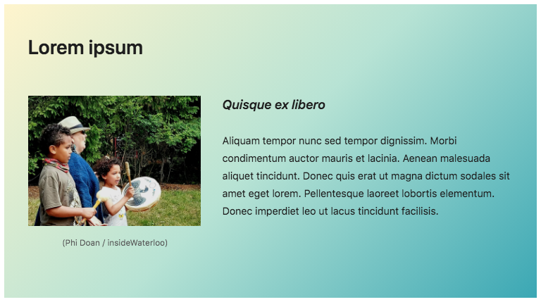
Columns Block
While a column is selected, you can change the width of that individual column in the settings sidebar.
In the settings sidebar for the outer container of the column block, you can find options to:
- Change text colour and background colour;
- Modify the number of columns in the block.
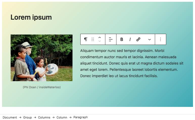
Group Block
In the settings sidebar for the outer container of the group block, you can find options to:
-
Change text colour;
-
Change the background colour and pattern (Solid or Gradient).
If you’re having trouble selecting individual blocks within a group that includes multiple blocks nested within each other (ex: trying to select an image block within a columns block within a group block), try selecting the block using the block breadcrumbs that appear at the bottom of the page instead of clicking on the block directly. The breadcrumbs appear whenever you have a block selected and list all the parent blocks for the currently selected block.
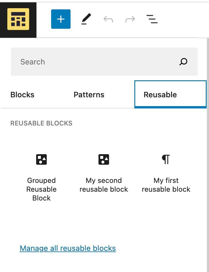
Reusable Block
If you'll use a group block repeated times, you can create a reusable block.
- Select the group block you’ll want to reuse.
- Click on the three dots that appear in the toolbar.
- Click on Add to Reusable blocks.
- Give it a name.
- Click Publish and then Save.
To add a reusable block you have already created, click on the + Block Inserter icon and select the Reusable tab. Click the block to add it to the post or page.
More Block
Separator Block
- Change the style of the pullquote (Default, Wide Line, or Dots);
- Change the line colour;
- Select a default style for any additional separator blocks you add to the post/page.
Spacer Block
 Can't find what you're looking for?