
Email setup
“From” label
- Connect an email that you monitor. Many ESPs allow readers to reply directly to the emails you send. This is a big opportunity to open a line of communication with your audience.
- Use your name. It’s more engaging and personal than your publication’s name. Or you could combine the two, like “Amy from Indiegraf”
Subject line
- Add personalization. Use merge tags to personalize your subject lines with each recipient's name.
- Be descriptive. If it’s catchy, it’s a bonus. But most importantly: get to the point. Why are you sending this email? What’s the benefit to the reader?
- Keep it short. 9 words or less!
- Use emojis. Best practice is to include one emoji per email subject line.
- Test! Some ESPs gather data on which of your headlines is best performing, but you can dig into this yourself as well. Make note of what subject lines have the highest open rates, and try to identify a common thread.
Preview text
- Play off your subject line. Maybe it’s the punch line to the joke or pun in your subject line, maybe it elaborates on the topic, or maybe you add a few other stories that your email also includes.
- Keep it short. Under 90 characters
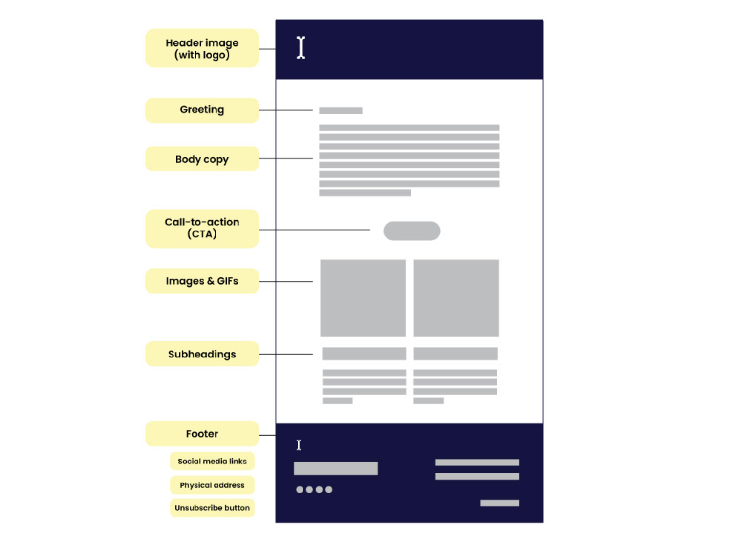
Email body
Copy
- Personalization. In the greeting. Include merge tags to use the reader’s personal information in the copy. For example, if you’re asking a question, include their name at the end? “How many apples a week do you eat, Amy?”
- Make it skimmable. Break up the copy into shorter paragraphs than you would a normal article, use headings and subheadings, and use design (colors, font size, images) to call attention to key messages.
- Keep link text short. And make it clear where the link is heading.
- Include a personal sign-off. The more personal you can make your brand, the more connected readers will feel to you.
Design
- Width. Keep your email between 500 and 650 pixels wide.
- Images & GIFs. Including graphics is a great way to break up the email and keep readers engaged. Just make sure they’re relevant and add to the editorial rather than distract.
- Link your images. Add a link to the images that leads to the article you’re referencing. You’d be surprised how many people will click.
- Keep the design clean. Use now more than two fonts or colors.
- Include your logo in the header. And remember to link it to your website.
- Make 1-2 templates. And stick to ‘em!
Call to action (CTAs)
- 1-2 buttons per email. This is also a great way to experiment with different button copy to see which is most effective. (An imperfect, but helpful exercise!)
- 🔔 Revenue campaign emails should only include 1 CTA so there’s no opportunity to be distracted from the ask!
- Embed links in copy. The more opportunities to move your reader from their inbox to your website, the better.
- Put a CTA above the fold. Even if you have the most interesting newsletter in the world (which we’re sure you do!) readers lose attention quickly. Especially when running a campaign for support or feedback, be sure there is a clearly labeled button in view when the reader opens the email.
- Mix it up. Change the button copy for your CTA regularly. If your readers see the same one repeatedly, it will become a habit not to click.
- Track clicks with UTMs. UTM tracking links are URLs that have pieces of code attached to them (called parameters) that help you track where your website visitors are coming from. If you want to see how many people who read your latest story came from your newsletter, you may use a UTM link and see the results in your analytics tool.
- 🔔 This is especially important during campaign periods, as there is lots of opportunity for learning.
Interactive elements
- Engage with your readers. If your email service provider (ESP) allows, embed surveys, quizzes, and other interactive elements. Even if your ESP doesn’t have these features, you can still ask a question at the end of the email to encourage conversation.
Footer
Optional elements
- A one-liner. An evergreen sentence message to your readers. Maybe it’s your publication’s tagline, or an invitation to engage elsewhere online.
- Social links. Include links to other places you hang out online.
- Contact info. Let people know how they can reach you.
- “Donate” button. It’s good to have one constant ask for donations in your email, the footer’s a good place for that!
Required elements
According to CAN-SPAM (USA) and CASL (Canada), you must include:
- Your company’s physical address. Or another mailing address you can be reached at.
- An unsubscribe or email preferences link. And you must honor the unsubscribe request promptly.
- A link to your website’s privacy policy.
Data points
Open rate
- Benchmark: 35%
- What it means and why it matters:
The open rate shows what percentage of your audience opens the emails you send them. Open rates are one of the best ways to determine if email strategy is working. If you have a higher open rate, it usually means your subject lines resonate with your audience, and that the quality of the journalism within keeps them coming back.
Click-through rate (CTR)
- Benchmark: 4.5%
- What it means and why it matters:
The click-through rate is the percentage of successfully delivered emails that got at least one link click. This number shows whether or not your audience finds the emails you send compelling enough to leave their inbox and learn more on your website.
Bounce rate (incl. hard + soft)
- Benchmark: 2%
- What it means and why it matters:
A “soft bounce” means that the email address you sent an email to is temporarily unavailable. This could mean they’re on vacation or their inbox is full.
A “hard bounce” means that the email address was invalid, or your email got caught up in a spam filter.
Keeping your list ‘clean’ means eliminating the hard-bounced emails. Though this practice temporarily lowers your subscriber count, it will also keep your bounce rate low. Why include emails in your list when they don’t receive anything?
Unsubscribe rate
- Benchmark: 0.1%
- What it means and why it matters:
The percentage of readers who unsubscribe after an email. Some churn is totally normal, so don’t worry too much unless the unsubscribe rate suddenly climbs.
Usage
- Don’t spam your readers. If you have more than one newsletter or campaign, be mindful of cadence.
- Consistency is key! Pick an email schedule, and stick to it.
- Segment whenever possible. Many ESPs have ways to group users according to how they interact with your newsletter. These can include the date they joined, how often they open your newsletter, if they’ve given you financial support, or how they signed up for your list. Use this to your advantage! For example, if you’re asking for donations, you could exclude existing supporters so they don’t get asked for money any more.
- Clean your email list regularly. The key to keeping healthy, accurate newsletter data is keeping your subscriber list clean. That means removing anyone who’s been inactive (hasn’t opened an email) for a long time. They could be old readers or invalid email addresses. A good rule of thumb is to do this every six months.
- Always preview the mobile view. Most people will be reading your email from their phones whenever they find a free minute in their day. So make sure that mobile-view shines.
- Test, test, test! Don’t be afraid to experiment with, well, everything! Try many different subject lines, preview texts, button designs, and email layouts. Then track which ones do the best to try to spot patterns in your audience’s behavior.
Email accessibility
- Structure your content logically. Screen readers (an assistive tool for people with disabilities) will read your newsletter to audience members. One way to tell if the content will be read to your audience members in the order you intended is to preview your email on your phone. When in mobile view, the content will rearrange itself to fit a smaller screen. This is also the order the screen reader will call out your content.
- Use headers. Headers are a structural staple for screen readers. This is how people using a screen reader will move through or skim your content to see what they’d like to hear more about. Using your email service providers H1 and H2 tags make this easy!
- Keep contrast high. Those who have vision issues (including partial blindness or color blindness) appreciate high contrast designs. This free tool will help you analyze if you’ve got enough of a contrast in your designs.
- Don’t embed text in your images. If it’s a static image with text on it, the screen reader will not be able to read the copy.
- Use alt text for images. When you upload an image, you’ll see an option to include alt text. This is a brief description of the image that's displayed when a subscriber can't view your images. Alt text should be short but descriptive, and highlight the relevance of the image to your message.
- Label buttons literally. Make sure the button or link text describes exactly what the person will be clicking to. For example, “Check it out” is way less descriptive than “Read the article”. But linking the article name is even better! The more descriptive the linked text, the more accessible your email.
Deliverability
Deliverability is simply the act of delivering emails to subscribers' inboxes. It sounds simple enough, but it’s not uncommon to accidentally end up in junk mail. Follow the tips below to help keep yourself out of the spam folder:
- Encourage readers to add you to their contact list. It can be as simple as a quick note in your welcome email.
- Ask readers a question at the end of emails. If people reply to your newsletters, you’re more likely to stay out of spam.
- Keep your sender name consistent.
- Enable double opt-in.