Types of CTAs or House Ads
We will often work with 3 types of CTA:
- Slide-in
- Popup
- Before/After
Check their differences and best practices below.
1. Slide-in
What is: A popup or an opt-in form that slides in politely from the corners/sides of the screen. Highly recommended setting a two step slide-in CTA, where in the first step you make the user a direct ask to subscribe to your newsletter. The second step will only appear after a user has subscribed. It’s an opportunity to ask for their support and to offer more information.

💡 Tips for Slide 1
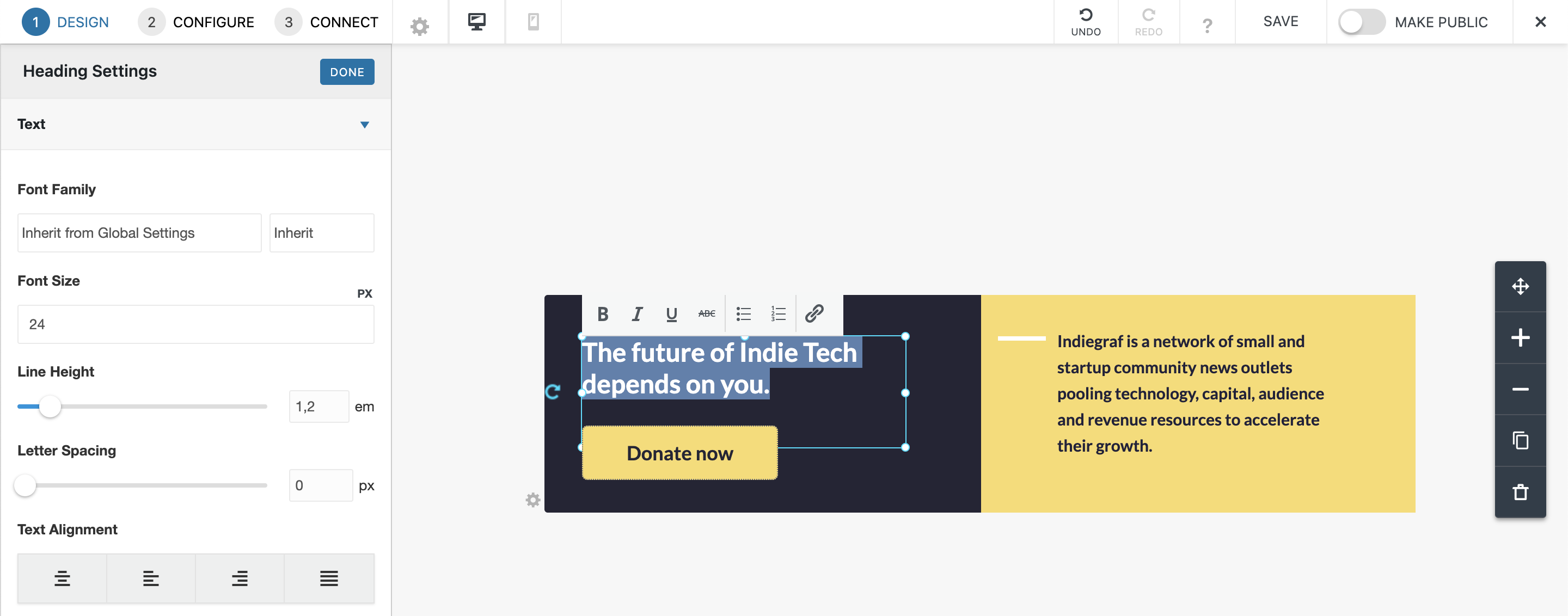
Heading: Make a direct ask. This will be the first thing a user reads, so be upfront about what you’re asking them to do. Make it clear and concise.
- Example: “Subscribe to XYZ Publication” or “Sign up for the XYZ Publication newsletter."
Description: Tell them why and expand on the offering. Explain further what they’re signing up for. This can include how often and what day you send it, the content that’s included, etc. Make sure you tell them why they should subscribe.
- Example: “Get important news from our community in your inbox twice a week” or “We’ll deliver local news direct to your inbox every Wednesday.”
Button: Make sure the button stands out by choosing colors that pop and a font that is big and bold.
💡 Tips for Slide 2
Heading: Even though it’s unlikely that a user will contribute directly after subscribing, seize the opportunity to educate them on how you’re supported. Warm them up to the idea while you have their attention or emphasize your value proposition.
- Example: “We’re funded by you” or “We rely on our members” or “100% local.”
Description: Let them know that you’re grateful for their subscription and that they can expect your newsletter in their inbox soon. Explain how their support makes a difference. A lot of readers are still getting used to the idea of voluntarily supporting local news. Explain that every reader who chooses to give matters greatly.
- Example: “Thank you for subscribing! We’re powered by readers like you who invest in local news. Consider supporting us today.” or “Thanks so much! Check it out in your inbox and consider supporting us (or start supporting us today because we know you’ll love it)."
Button: Offer them more information. We don’t want their journey to stop here, even if they’re not ready to contribute. Give them the option to learn more about who you are, check out the team, or read through your guiding principles. But ultimately ask them to support you. Since support is the ultimate goal, give them the option to contribute. Even if they’re not ready yet, it prepares them to expect another ask down the road.
.cp-module-slide_in .cp-popup {
z-index: 9999999;
}
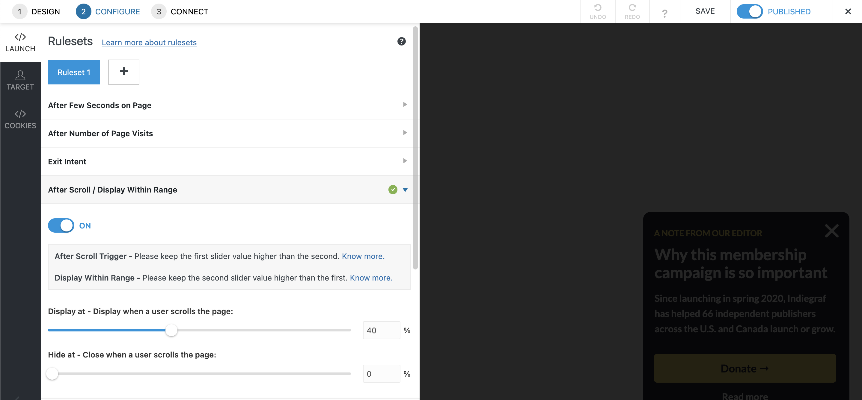
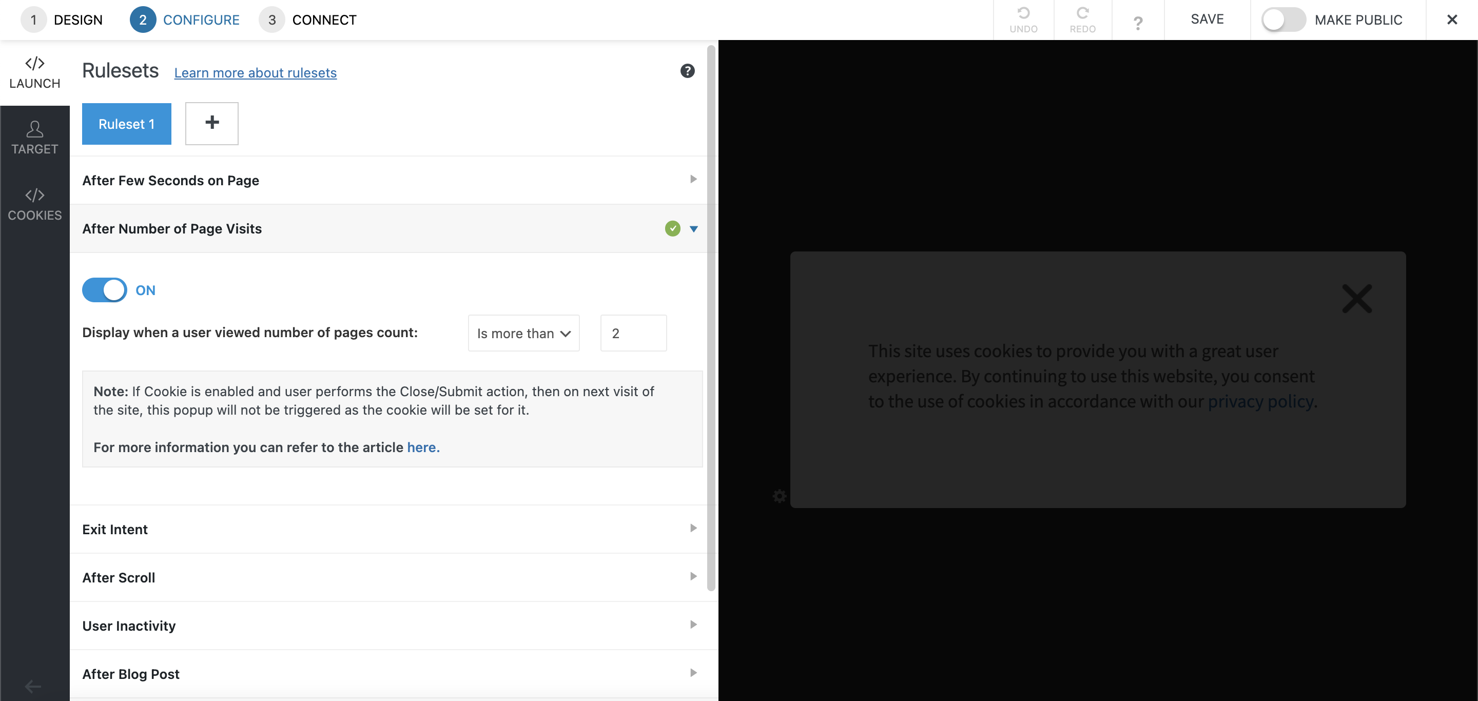
Popup
What is: A Light-box overlay that can be launched on any web page with a dedicated call to action. A full-screen popup can be very effective, but it’s most often used during concentrated campaigns.
💡 Tip Make it timely. Add a countdown timer or use time-sensitive language to put on the pressure.
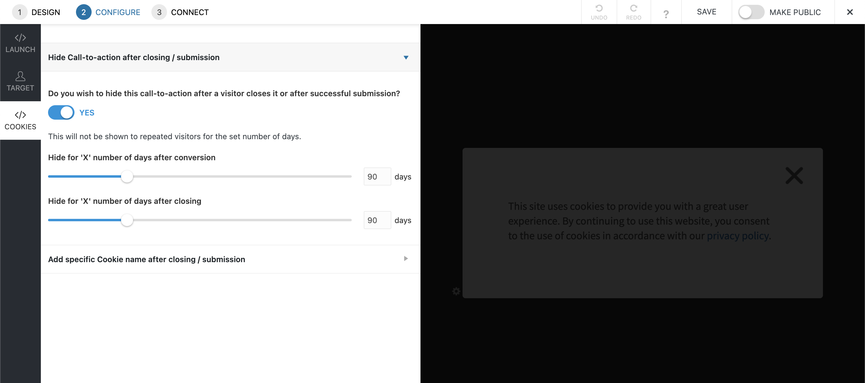
Best practices: This type of popup is really invasive and disrupts the user journey in a very abrupt way. If triggered after the page loads or on multiple pages, it may causes the reader to leave your website. For that, we recommend to:
- Go to Configure > Launch
- Click on After a Few Seconds on the Page and turn it off
- You can either Click on After Number of Page Visits, turn it on and choose a number of pages visits necessary to trigger the popup, or trigger the popup After Scroll
- For this specific CTA, make sure that the popup won't be triggered again after the reader closes it by clicking on Cookies, on the left navigation bar
Before/After
What is: A banner or an opt-in form that can be embedded before or after your blog post on a page. Placing a “support us” CTA at the bottom of each article. It’s a good opportunity to appeal to readers who are engaging with the work that you’re doing.

💡 Tips
Heading: Be direct. Don’t avoid the subject - make it clear that you’re asking for their support. They just spent a couple of minutes reading your article, they’re primed for the appeal.
- Example: “This article is made possible by our readers” or “Enjoy the article? We need you to support this work”
Description: Emphasize the why! There’s a lot of room to play around here. The reader has already made it to the bottom of the article, so they’ll likely take an extra minute or two to read your appeal.
Button: Make it pop. Ensure that the user can’t miss the button, even if they don’t read through the text.
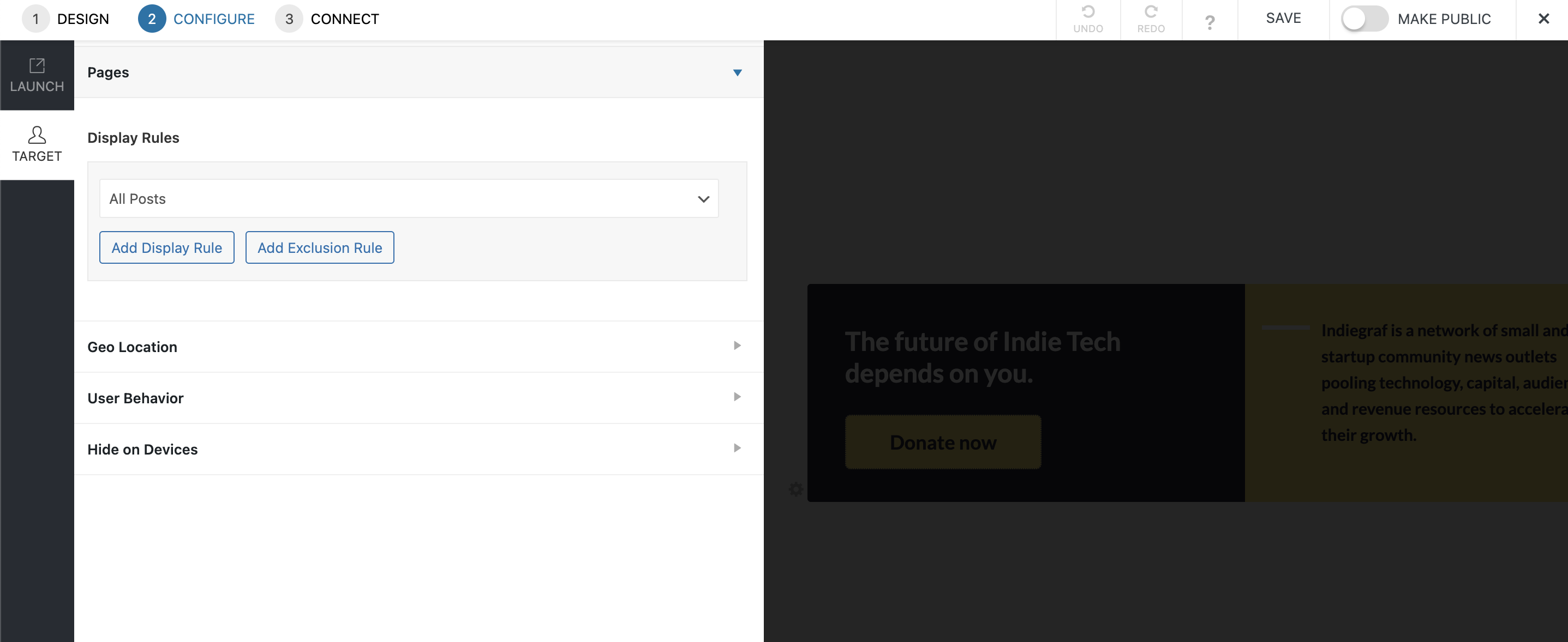
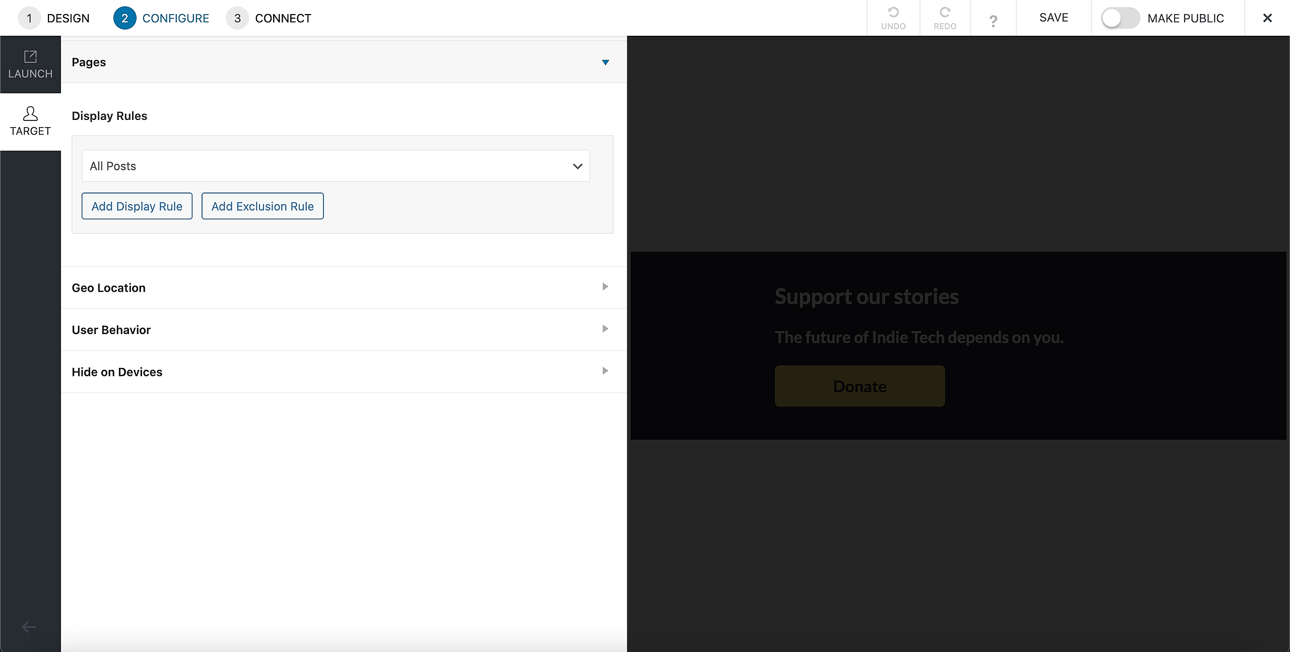
Best practices: Remember to set the Display Rules on All posts on Configure > Target.
Managing CTAs
🟡 Please remember to set the mobile view! On the top navigation, after "Connect" there's a mobile icon. Please click on it to style your House Ad
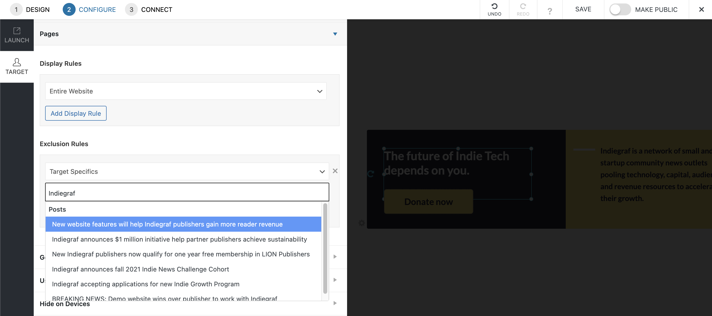
Enable House Ads on specific pages, categories or post
- Go to House Ads > Dashboard and open the desired CTA by clicking on the Name;
- On the top left corner, click in "Configure";
- On the sidebar, click in "Target";
- Click on "Pages" and on "Display Rules";

- Make sure to set All Posts on Display rules for in-line and before/after posts CTAs
- Select "Target Specifics" to display the CTA on a specific:
- Page: Type the title of the page
- Post: Type the title of the post
- Category: Type the category name
Disable CTA on specific pages, categories or post
- Go to House Ads > Dashboard and open the desired CTA by clicking on the Name;
- On the top left corner, click in "Configure";
- On the sidebar, click in "Target";
- Click on "Pages" and on "Display Rules";
- Select "Target Specifics" and add the name of the page or title of the post:
- You often don't want slide-ins CTAs on the following pages:
- Privacy Policy
- Support Us
- Newsletter
- Terms of Use and Payment Policy
- Thank you
- Contact us
- Click in "Save" and "Make public"
Design tips
- Contrast: It’s important that buttons and texts stand out from the background. Images on the background are tricky, so you need to be extra careful;
- Legibility: fonts needs to be big enough, specially on mobile. It’s hard to fix a number here, but it works best with fonts that are bigger than 16px;
- Hierarchy: the button needs to stand out more than “Read more”, and other elements
Triggering Pelcro Modal
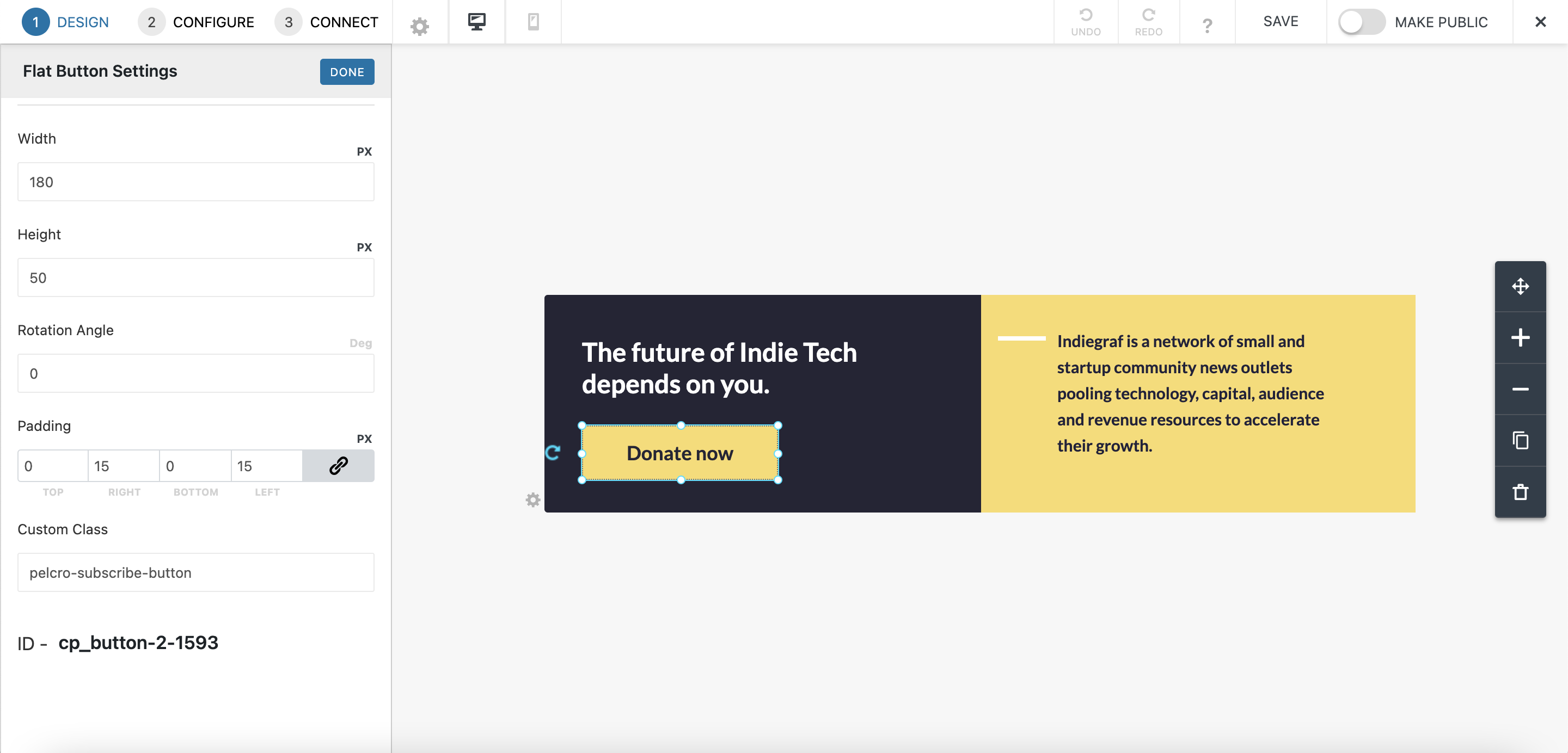
pelcro-subscribe-button