Please provide
- A brand guide, if you have one. A brand guide is a PDF document that details a company’s visual identity, along with rules and guidelines for any public-facing communication. Brand guides set forth rules for official logo usage, font type and color, typography, and tone;
- All logos. PNGs with transparent backgrounds are required. If you have any vector files (SVG, EPS, or AI, with SVG being the preference) please include those as well. We require white and black versions of the logos, along with a full colour version. When in doubt, send us everything you have! If you only have a logo with a white background, please provide a large size of this logo (minimum 600px width) so we can help you remove the background.
- Horizontal, vertical, and square versions of your logo are good to have. On our current header, we feature a horizontal logo on the top left corner (larger width than height). The preferred width/height ratio for this logo is 2.5:1, but it could go up to 4:1.
- A colour palette for us to use on your website. If you don’t have an existing colour palette, Adobe Color is a great free tool to help you create one using colour harmony rules. You can even upload an image that has the tones and feel you’d imagine on your website, and Adobe Color will pull a colour palette from it. If you still need help or advice on this, please ask Indiegraf!
- Ideally, your colour palette should have 5 colours and should feature:
- Your brand’s main colour(s);
- An accent colour;
- Neutral colours (“neutral colors are a necessity for any correctly-crafted color scheme. Even if you only use them for text elements, every professional color palette should include neutral colors. As beautiful as non-neutral colors are, website visitors will, at one point or another, need a “break” from visual stimulation, especially when trying to process qualitative information through text.”)
- Here is more information on website colour schemes if you are interested.
- A favicon (or “tab icon”, visible next to tab titles). Your favicon must be a multiple of 48px square, for example: 48x48px, 96x96px, 144x144px and so on. PNGs are preferred.
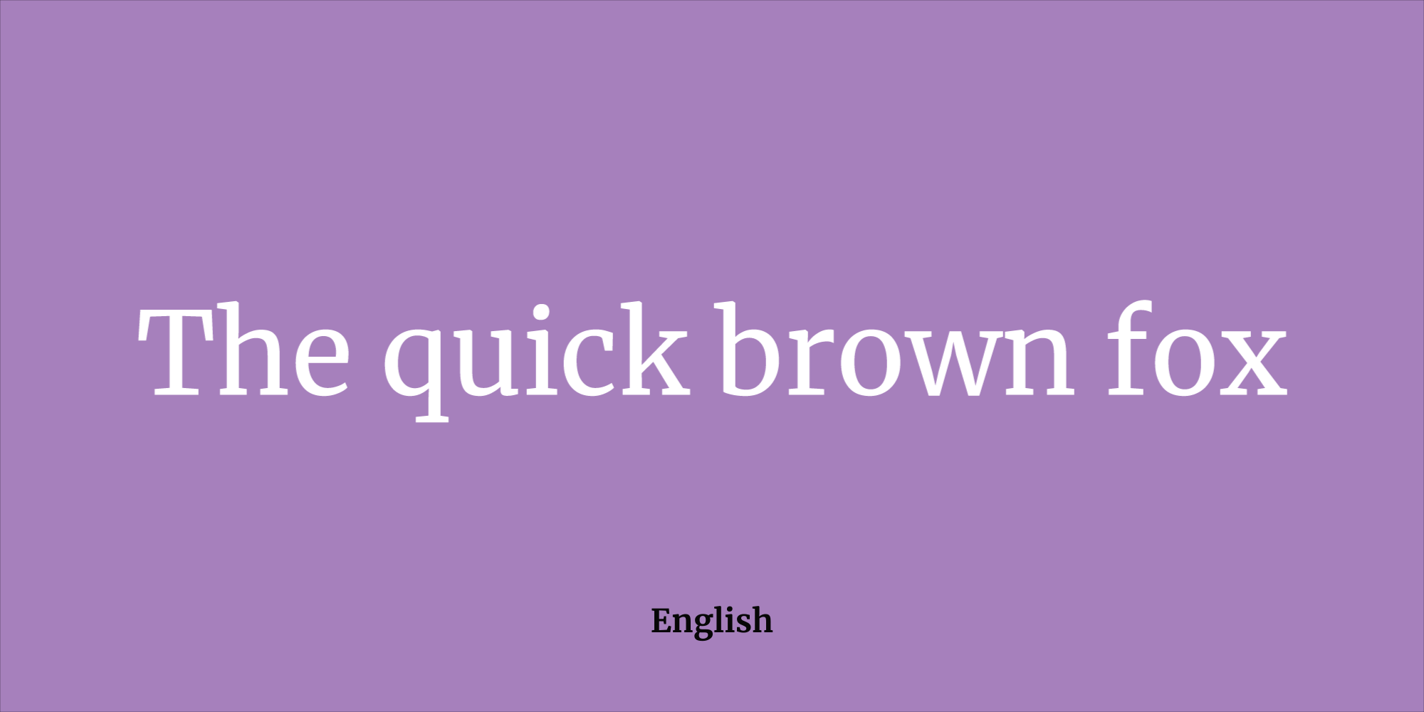
- Font pairing. Please identify 2 Google Fonts that will be used on your website. We usually use a sans serif font for headings, and a serif font for body copy.
- A set of images that could be used as website backgrounds. Please provide images that are large and of high quality: 1920x1080px is ideal (the preferred ratio is 16:9). The images should be at least 72 ppi. We request a minimum of 6 images, but the more the better!
- Note: this is in addition to team photos, author photos, etc. that might be featured at smaller sizes on the landing page/website, and that don’t need to be that large.
How to choose fonts?
- It has multi-language support: if the font has only basic Latin letters, auto-translate can shift your layout into some other font for the missing characters, giving it a “ransom note effect” where individual, accented letters change and stick out;
- It has at least the basic weights and styles: check if the font has, at least, a regular, italic, and bold (and bold italic) weights;
- Choose clear and recognizable letterforms: Text is most legible when the eye can easily distinguish between letters. Some typefaces are designed to simply be slick and rhythmic—pleasing to the eye. Legible typefaces have far more nuance among the letters;
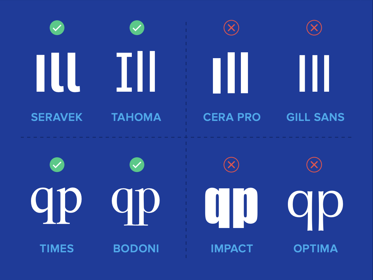
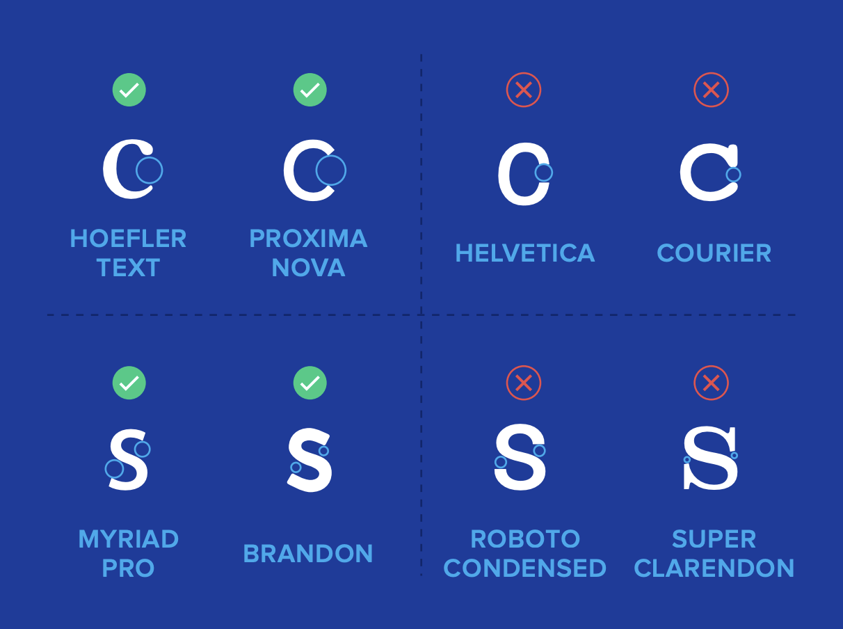
- Open Forms: Letters that are airy and open are less likely to blur into closed shapes. This should be considered specially for small or long form texts;
Avoid:
Overusing italic: Italics can be used for giving certain emphasis on a particular word or phrase and it should be used sparingly. Don’t overuse italics as they will make your blog posts look cluttered, so only use them when you really need to stress something out
Script fonts: Script fonts are never suitable for long-readings. The incorrect use makes the design look inappropriate for your brand strategy. To make no mistake, select a more neutral font.
Thin fonts: A light and thin font is very unreadable and does not imply that the information is important. Regular, Semi-bold and Bold are better for readability & accessibility.
Condensed fonts: Condensed fonts can be very hard to read, and its variations of most fonts should be used sparingly or avoided in projects with blocks of text. Plus: on a large block of text, condensed fonts imprint the feeling of riding the train at rush hour. Not a good feeling to match your brand.
Suggested font pairings
- Source Sans (Headings) and Merriweather (Body copy)
- Lato Black (Headings) and Lora (Body copy)
Adobe fonts
A common alternative is Adobe Fonts, but it's not recommended. Adobe Fonts require an Adobe subscription and sometimes don't have enough glyphs or styles.
If a publisher choose an Adobe Font, we will need to:
- Check if the font has enough glyphs and styles;
- Ask the publisher (or the holder of the Adobe subscription) to provide an embed script. Here's a step by step guide.
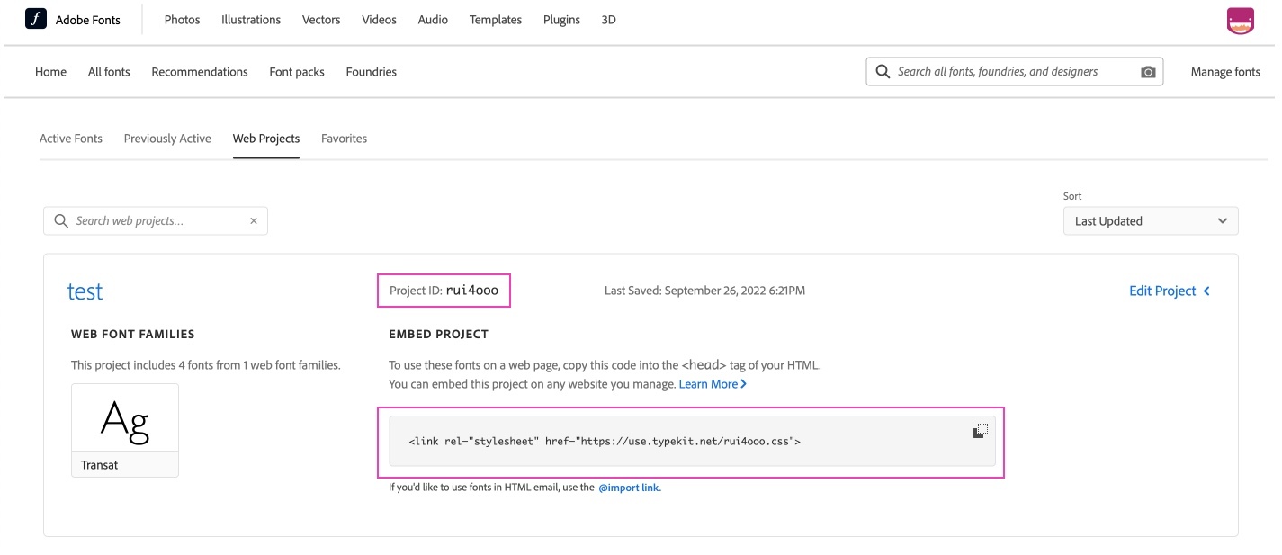
- Ask the publisher for the web project ID. It appears on the Web Projects tab (https://fonts.adobe.com/my_fonts?browse_mode=all#web_projects-section)